I used to hear about the Power BI tool everywhere, in job listings, in LinkedIn posts, in casual conversations between analysts I know. Today I decided to actually use it, not just to admire it from a distance, but to sit down, load in a dataset, and perform proper data analysis and build visuals worth presenting. Let me tell you, an afternoon with it taught me more than a month of reading about it ever could.
I started with a sales dataset, countries, products, dates, discounts, profit, the usual columns you would expect from a retail export. My first instinct, coming from a Django and PostgreSQL background, was to reach for a query. Instead, Power BI wanted me to drag fields onto a canvas and simply watch a chart assemble itself. That shift alone took some getting used to. Writing a query gives you full control over exactly what happens. Dragging a field onto a visual hands that control to the tool, and you learn to trust it, then verify it, then trust it a little more.
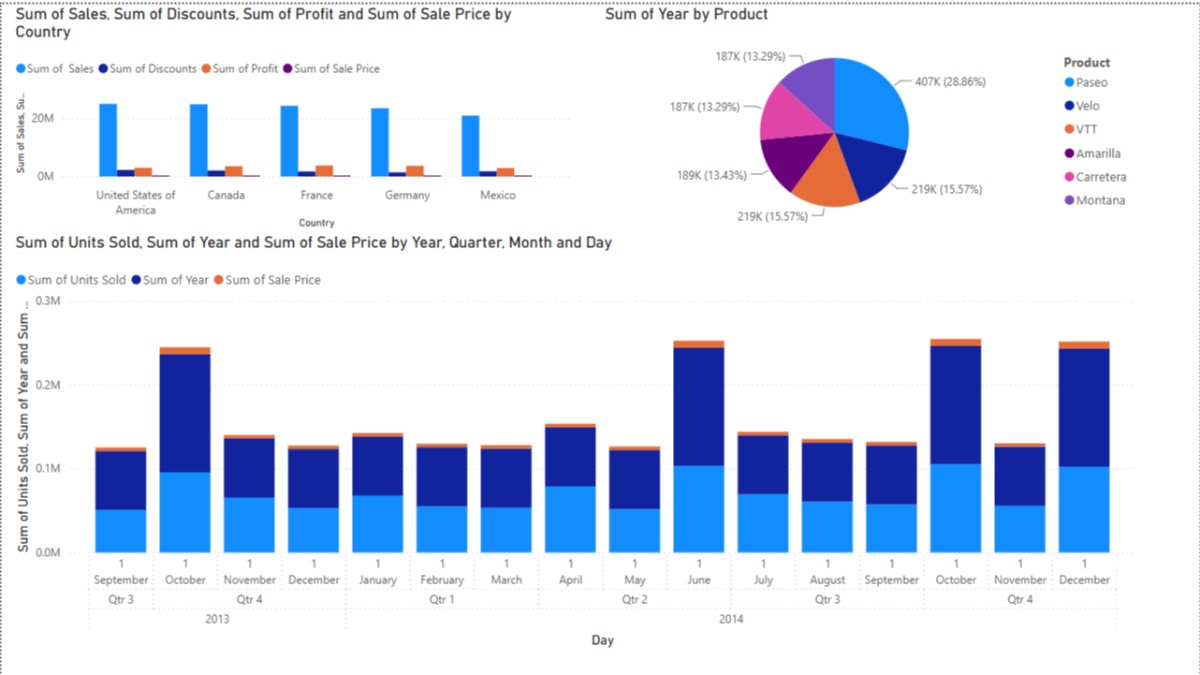
The first chart I built compared sum of sales, discounts, profit, and sale price across five countries, the United States, Canada, France, Germany, and Mexico. The United States towered over the rest almost immediately, and just seeing that gap rendered as a bar instead of buried in a spreadsheet column changed how fast I understood the data. That is the actual pitch behind Power BI, and now I finally get it firsthand. It is not that the insight was hidden, it is that a bar chart delivers it in half a second instead of the two minutes it would take scanning rows.
Next came a pie chart, sum of year by product. Paseo led the pack at nearly 29 percent, with Velo, Amarilla, Carretera, VTT, and Montana splitting the rest in a fairly even spread across the high teens and low twenties. Six product lines, one glance, one honest picture of where the volume actually sits. I did not write a single line of code to get there, which felt strange for someone used to building this kind of view manually in a Django admin dashboard with Chart.js.
The chart that actually impressed me most was the stacked bar showing units sold, year, and sale price across every month from September 2013 through December 2014. The seasonal pattern jumped out without me looking for it: a clear dip around November, a strong climb into June, another strong close in October and December. In a Django project, I would have had to write the aggregation query, group by month, and then wire up Chart.js myself to see that same shape. Power BI got me there by dragging three fields onto a canvas and letting the time hierarchy build itself automatically, down to year, quarter, month, and day.
What struck me most was not the visuals themselves; it was how fast the gap between question and answer collapsed. As a developer, I am used to building the tool that shows the insight. Today I was just the analyst asking the question, and the tool answered before I had fully finished typing it out. There is real value in that speed, especially for a business stakeholder who cannot write SQL and should not have to.
I am not walking away from Django or PostgreSQL; that is still where I build the systems that generate this kind of data in the first place. But I understand now why Power BI has such a strong hold in the analytics and business intelligence world. It closes the distance between raw numbers and a decision someone can actually act on, and it does it fast enough that curiosity does not die waiting for a report.